Feng Shuiing the Mouth of the House

DunferHeighes ph: John Ellis


I am in the process of picking out a paint color to repaint my front door.  I researched what the teachings of Feng Shui would recommend based on the direction the front door faces.

The practice of feng shui as it applies to front doors helps narrow down the choices.  Since the front door is "the Mouth of Chi", where the energy flows in ~ you obviously want as much positive energy to enter.  Who doesn't want or need a little more positive energy in their life?  Here's what I learned ~

W ~ ( metal) white, gold, magenta, silver, grey        
SW ~ (earth) pink, yellow, orange, brown, green                                      
N ~ (water) black, blue                                        
NW ~ ( metal) magenta, gold, yellow, copper, silver                                                                                
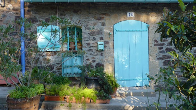
E ~ (wood) green, blue, turquoise
NE ~ (earth) orange, terra cotta, yellow, brown                                                                                                                                         
S ~  (fire) red, purple, pink                                              
SE ~ (wood)  green, blue


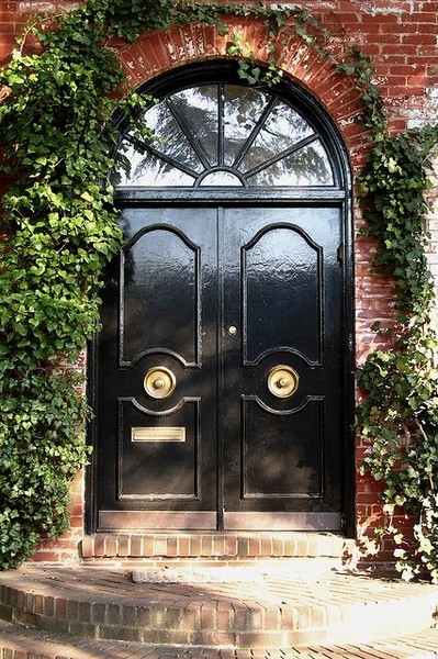
Black (water) represents ~ sophistication, power

via Benjamin Moore
via Couture zoo

Grey (metal) represents ~ clarity, precision, efficiency

via Laura S Mitchell

Green (wood) represents~ abundance, balance, renewal, money


via Distraction 99


Blue (water) represents ~ prosperity, wisdom, calm.  Dark blue has added benefit of dependability

via Brown Design

via Planting my voice


Purple (fire) represents ~ abundance, spirituality, dignity


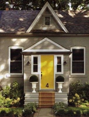
Yellow (earth) represents~ stability, optimism, sociable


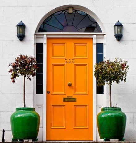
Orange (fire) represents ~ sociable, abundance 


Red (fire) represents ~ prosperity, abundance 


pink (earth, fire) represents ~ playfulness, calm, abundance

via Houzz

via Birch and bird

Make sure the front door is in proportion to your home and property.
The door should open inward and be solid. There are rules if it's glass as to what to do to solidify it.
Also, keep your doorway uncluttered, well lit, and free of too many distractions and SHARP objects!

As long as the color makes sense and coordinates with the rest of the house in terms of trim, climate, landscaping, etc ~ I think here's a place to really "show your true colors"


*There is a lot of cross over regarding the use of color.  Once you determine the direction of the door and the characteristics you would like to weaken or enhance ~ you continue to narrow down and narrow down.
Most importantly, it should always be pleasing to you


** My house faces south and I went with burgundy.

Love in the Time of Lilacs


Art work by Cheri Wallenberg

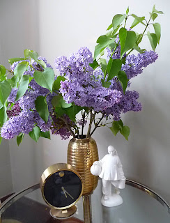
A harbinger of spring, the melodic sound of the songbird and ~ Lilacs. They were my grandmother's favorite, my mother's favorite, and now2, mine and my sister's favorite flower.  There is nothing more intoxicating then walking into a room that is filled with the fragrant bouquet of the lilac


Houzz


Elle Decor
                                             Swirling Wind and Rain.
                                           Lilacs Have Come, Spring Has Sprung.

                                           Pink, Purple and White.
                                          A Breeze Sways the Branch.
                                       Heavy Flowers Back and Forth.
                                            Lilacs Drip With Rain.
                                          Now, Sparkling in Sun.
                                       The Lilacs Cheer My Spirit.
                                             Beautiful Flowers.


Art work by John Harding


Country Living


 **TIP ~ before you put those beauties in a vase, after you have sheared it from the tree, on an angle, take a hammer and smash the end.  It opens up all the fibrous membranes and allows for better water absorption.


CLI


Jeff Lewis ~ Still Flipping Out


I had the chance to hear one of my favorite Bravo-lebrities,  Jeff Lewis speak the other day.  He was his usual funny, blunt, "flip", adorable self.  He is working on his 6th season of Bravo's Flipping Out.  I wasn't sure that it was still on TV when I saw his new show, Interior Therapy.  While Flipping out is shot like a documentary, Interior Therapy is Jeff helping people reinvent themselves, emotionally and physically (in terms of their living spaces).  Jeff feels that he is completely qualified for this task because he has had the benefit of a lot of therapy himself!
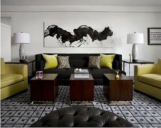


Jeff's design aesthetic can be described as relaxed modern.  He imbues a sense of warmth into a modern home and seamlessly creates a clean lined, neutral environment inside and out.  Working with grays, black, white, taupe, sage, and navy, Jeff said he is secretly terrified of color.  However, he is trying to bring a little more into his spaces via pillows, rugs, and artwork; just enough to make things POP.  He is working on trying to layer more without compromising the clean, uncluttered look.


Jeff had a few tips for the audience:

No money for art?  Use black and white photography.
Always mock up paint color on poster board before painting.
There are places to spend money, like a bed or sofa, and places to save money--rugs and accessories.
Jeff uses a lot of rug remnants and has them bound.  He likes a mix of high & low.
Have your money work for you to add value to your home.  It will pay off later.


Jeff, Jenny, Gage, and Zoila will all be returning for the next season of Flipping Out soon ~ stay tuned


** Spoiler Alert**
Jenny was not at the seminar because she was at her engagement party.  She is getting married~ to an orthopedic surgeon in LA.


Art In The Round

Larry Laslo ph: Eric Piasecki

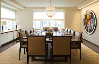
I have been lovin' round art work recently.  While round canvases are not new, they are still unusual. They bring a certain je ne sais se quoi into the space, no?
The circular shape immediately makes it look slightly contemporary, but you know I am a big advocate of
juxtaposing that with a traditional space, if that's what you're working with


Shawn Henderson


Jennifer Post


Forma Design


Björn Björnsson


Robert Stilin

Whether a high priced Hirst, a modest opaque circle, or something in between ~ It looks dynamic anytime, anywhere


CLI


Coach & James Nares~ Rockin it


Coach is not slowing down!  I spoke a month or so about their fabulous collaboration with Hutton Wilkinson based on the jewelry designs and ethos of the late designer Tony Duquette  (see here).  Now they have enlisted the talent of painter James Nares.  I'm sure this is only the beginning of  Coach's creative collaborations and I like where this is going!  I have always been a fan of Reed Krakoff's, the man is incredibly talented.


Coach  literally gave James Nares a blank canvas and had him do what he does best!  They have created a limited edition of 175 canvas bags in black, green, blue, orange, and fuschia for sale beginning in May.  

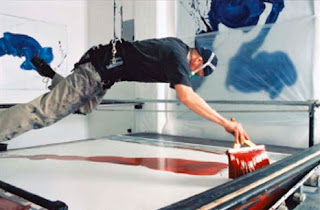
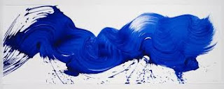
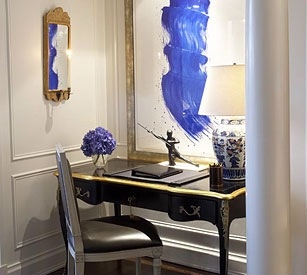
James is known for his single brush stroke paintings.  He literally is suspended above the canvas painting a
signature, single brush stroke.  He'll make many attempts until he feels satisfied that the brush stroke is as it should be.


via Tommoody.com


Michael S. Smith


Michael Rosenberg & Assoc.


Blue Carreon


via Susanne Randolph


Foley & Cox


John Barret via Elle Decor


I love them.  I have loved these paintings since I discovered James' work years ago.  They sing to me with the lyrical quality of the brush stroke and the movement and opaqueness of the paint.


ph's Classicaladdiction.com, the-best-home-design blog