I am on to something! In my last post I spoke of our collective awareness and desire of a more mindful existence. Well, unbeknownst to me at the time, Pantone, the color forecasters, were in full agreement! For the first time in Pantone's history they have chosen not one but two colors of the year for 2016. Rose Quartz and Serenity ~ a warm rosy pink and a cool light blue, as if plucked from the colors of a beautiful sunrise or sunset that only Mother Nature can create. These beauties are meant to be used together, but certainly not limited to such, and reflect a need in these turbulent times for peace and serenity. These colors convey a security, a mindfulness (ahem) that we need for our wellbeing. Psychologically these colors fulfill our desire for reassurance.
Don't even think baby or nursery. These colors have a deeper meaning behind them. This is a push toward gender equality and fluidity. Don't think masculine or feminine. The state of our nation, these troubling times, our confusion, and need for understanding and compassion are all wrapped up in these soft colors.
 |
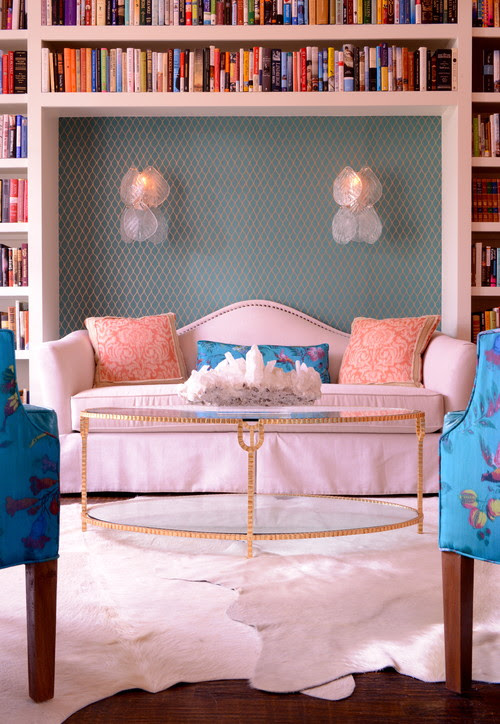
| Anthony Baretta |
 |
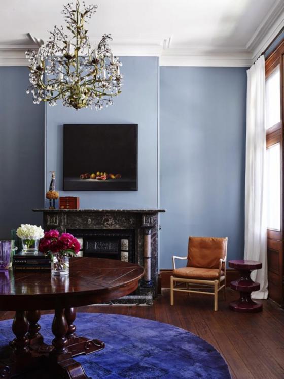
| Guillaume Gentet |
|
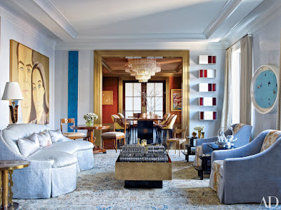
| Mark Gillette, ph: Luke White |
On a personal note, life feels abundant and I am quite optimistic about the coming year, so these colors feel really in tune with that for me. They are soothing, happy and reassuring. Our homes should always be a reflection upon what is going on in our soul. If you feel the need for more calm in your life, or you are already optimistic and upbeat ~ think about incorporating these colors in some way, however large or small, fashion forward, or design minded.
 |
| Chanel, always in the forefront |
 |
| Ippolita |
 |
| Them Browne, ph:Bryan R. Smith |
The rose quartz and serenity blue, with almost a hint of periwinkle, take on an almost warm and cool neutral. They are weightless and airy, like that beautiful sky above. These colors coordinate with almost any other color on the color wheel.
 |
| James Aman, ph: William Waldron |
 |
| Tom Dixon lighting |
No matter the "color of the year" as defined by different color authorities, everyone agrees ~ a sense of calm and a march towards mindfulness ring supreme. It's a far cry from marsala (last year's color of the year.)