Pantone's predictions for the spring palette have inspired me once again. With the forecasters' & influencers' candy colored confections arriving in stores, fashion ~ home and runway, is taking a decidedly BRIGHT turn. I'm all in.
Yellow = happy, no matter what is "on trend" ~
 |
| Jamie Drake: it's an oldie but a goodie |
The color of the year speaks loud and clear ~
 |
| Jeffery Bilhuber |
Mint means business this coming season ~
 |
| via Elle Decor |
A bold Blue melange of shiny and matte ~
 |
| via Homeklondike.com |
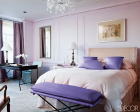
Lilac always looks soft, subtle, and sophisticated ~
 |
| Brett Beldock |
 |
| John Saladino |
Whether you consider yourself a "color" person or not, there's something to be said for a shot of it. It can be the perfect pick me up, especially as spring draws near. Use a lot or use a little, the key is to temper it with black, white or any neutral (I love grey or beige), just to tone it down a bit.
If you're going for that dramatic monochromatic look, remember ~ texture, texture and texture


GREAT PICS:) I really adore your blog..so much nice inspiration. I wish you a lovely week:)
ReplyDeleteLOVE Maria at inredningsvis.se
(Sweden)
Thank you Maria, I wish you the same
DeleteLove the spring colors! And the pictures are stunning! We just did a feature on resort-themed indoor/outdoor fabrics on our facebook and google+ pages! Hopefully the colors will coax spring out!
ReplyDelete