Pages

Blasting into 2016


Wishing you peace and prosperity in the coming year!  For me, this will be a year of forging new paths,  deeper discovery and defying gravity.  Join me on this journey, won't you?


From Kennedy Space Center: over and out 2015


                                                XOXO ~ Carrie


A Voyeuristic Christmas


Because I do not celebrate Christmas, some years I try to think of a way to decorate my home that reflects the season saying, "Happy Holidays (but not in a Christmasy way)," and "I am thankful," and "I love an excuse to decorate and I am super attracted to anything that sparkles," but this year because I will be traveling, I am happy to sit back, relax, and enjoy others' beautiful holiday decor.


                                                      I wish you health


via OKL

                                               
Alessandra Branca

                                                           I wish you contentment


Aerin Lauder


                                                                I wish you happiness


Bronson Von Wyck

                                                        I wish you peace of mind


                                                          I wish for you love...


and everlasting joy!


Whatever you think beautiful, meaningful, hard-fought, you deserve it!  I hope you get everything you wish for this holiday season  <3


Drake + Anderson


The big buzz in the New York interior design world is the merging of AD100's top interior designer and Hall of Fame inductee Jamie Drake with a former intern of his, Caleb Anderson, forming  Drake + Anderson.  This is a great marriage of passionate, talented design minds!

They will each finish their individual projects as they rebrand the new business.  Jamie has an amazing portfolio of high profile projects and Caleb is a star on the rise.  Jamie's work is known for bright color, high glamour, historical preservation, and mid century modernism.  Caleb is masterful at blending the traditional and the modern with a curator's eye.  The new firm will move forward melding the men's styles as they move into the future.  Caleb's interiors have been called "reverent and refreshing."  In his thirty plus years in the field Jamie has been a prolific designer with furniture, rugs, bath fixture collections, and more.  They each speak of their admiration for one another.  The partnership will benefit as each man brings different strengths to the business while agreeing on making bold design choices with the juxtaposition of old and new and artfulness as an anchor.


Caleb


Jamie


Caleb


Jamie


Caleb


Jamie


The master once taught the student, and now the student may be teaching the master.  I can't wait to see what they create together and how they marry their aesthetic.      


2016 Colors of the Year


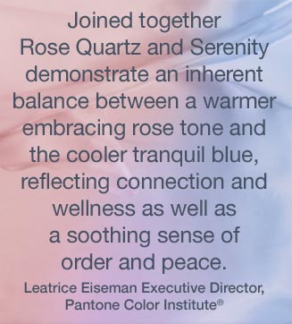
I am on to something!  In my last post I spoke of our collective awareness and desire of a more mindful existence.  Well, unbeknownst to me at the time, Pantone, the color forecasters, were in full agreement!  For the first time in Pantone's history they have chosen not one but two colors of the year for 2016.  Rose Quartz and Serenity ~  a warm rosy pink and a cool light blue, as if plucked from the colors of a beautiful sunrise or sunset that only Mother Nature can create.  These beauties are meant to be used together, but certainly not limited to such, and reflect a need in these turbulent times for peace and serenity.  These colors convey a security, a mindfulness (ahem) that we need for our wellbeing.  Psychologically these colors fulfill our desire for reassurance.

Don't even think baby or nursery.  These colors have a deeper meaning behind them.  This is a push toward gender equality and fluidity.  Don't think masculine or feminine.  The state of our nation, these troubling times, our confusion, and need for understanding and compassion are all wrapped up in these soft colors.


Pantone Color of the Year 2016 | KitchAnn Style


Anthony Baretta


Guillaume Gentet


Mark Gillette, ph: Luke White

On a personal note,  life feels abundant and I am quite optimistic about the coming year, so these colors feel really in tune with that for me.  They are soothing, happy and reassuring.  Our homes should always be a reflection upon what is going on in our soul.  If you feel the need for more calm in your life, or you are already optimistic and upbeat ~ think about incorporating these colors in some way, however large or small, fashion forward, or design minded.

Chanel, always in the forefront


Ippolita

Them Browne, ph:Bryan R. Smith


The rose quartz and serenity blue, with almost a hint of periwinkle, take on an almost warm and cool neutral.  They are weightless and airy, like that beautiful sky above.  These colors coordinate with almost any other color on the color wheel.


James Aman, ph: William Waldron


Tom Dixon lighting


Art I was drawn to @ Art Basel

Rome Northover ceramics

Roar + Rabbit for West Elm


via Lamps Plus


Wallpaper by Calico Wallpaper


No matter the "color of the year" as defined by different color authorities, everyone agrees ~ a sense of calm and a march towards mindfulness ring supreme.  It's a far cry from marsala (last year's color of the year.)


The Year in White


Pattern and color have their place, but give me a white room!  I love a neutral palette.  It feels soft and serene.  Something void of color soothes my soul!


 I understand it does not resonate with everyone, but I will tell you, it's a trend.  Warm white, if you can call shades of white a trend, is the color for the coming year.  It really is, and always will be, a classic.


Sherwin Williams' director of color marketing describes their "of the moment white" as directed towards a shift in mindfulness, a purity in atmosphere.  If there is a trend happening here, I think it's the mention of mindfulness.  If you notice, there is a lot of talk about the importance of mindfulness in almost every aspect of one's life.  Obviously we would want to bring it into the home as a reflection of the awareness as to how we want to feel; a stillness created by a serene environment that is good for your body and mind.


The complexity of white is mind boggling.  The undertones and hues are innumerable.  It can be as etherial and light as a whisper while still bringing out the sharp angles and lines when shadows fall.  It can be as warm as sunshine on your shoulders or cold as ice and snow.  
  It directs your eye right where to go while framing and flattering architecture or a focal point.


Make sure the undertones of the chosen white compliment the surrounding color , even if  the only color is coming from outside the window.


It's clean, it's fresh, but It's complicated.