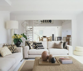
I understand it does not resonate with everyone, but I will tell you, it's a trend. Warm white, if you can call shades of white a trend, is the color for the coming year. It really is, and always will be, a classic.
Sherwin Williams' director of color marketing describes their "of the moment white" as directed towards a shift in mindfulness, a purity in atmosphere. If there is a trend happening here, I think it's the mention of mindfulness. If you notice, there is a lot of talk about the importance of mindfulness in almost every aspect of one's life. Obviously we would want to bring it into the home as a reflection of the awareness as to how we want to feel; a stillness created by a serene environment that is good for your body and mind.
The complexity of white is mind boggling. The undertones and hues are innumerable. It can be as etherial and light as a whisper while still bringing out the sharp angles and lines when shadows fall. It can be as warm as sunshine on your shoulders or cold as ice and snow.
It directs your eye right where to go while framing and flattering architecture or a focal point.
Make sure the undertones of the chosen white compliment the surrounding color , even if the only color is coming from outside the window.
It's clean, it's fresh, but It's complicated.


No comments:
Post a Comment
If you like what you read here at Carrie's Design Musings, consider leaving a comment wouldn't you? XO