Seeing Spots or Managing Madness


To say Yayoi Kusama is hot for spots is an understatement.  She is best known for her meticulously executed dot patterns.  Her work is marked by her obsessive vision.  She invites the viewer into her psychosis .  The dots have no sharp points, no hard edges, it's just infinity.
Yayoi has received fame and recognition, but they came at a cost.  She now works happily each day in her studio in Tokyo where she is Japan's most prominent contemporary artist.


The Passing Winter ph: James Deavin


The Studio via Ground Magazine


The Flower #2


At 83 years old, a collaboration with Marc Jacobs at  Louis Vuitton yielded not only a spotted spectacle of a store in London, but outfits and accessories that looked spot on (have you had enough yet? )


Take a few minutes to watch the video about Yayoi's journey and connect the dots (sorry last time)


video from You Tube via Tate Modern
2 and 3 above that via Louis Vuitton


A Renovation Near and Dear


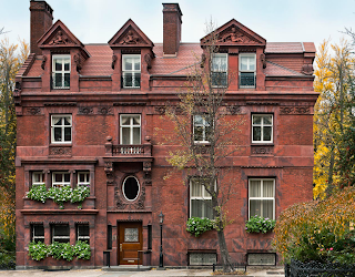
My father once worked in this historically significant building in Philadelphia.  It once had a brass plaque stating the name of the law firm that occupied it, but now it is known as The Jayne House, a much more dignified pronouncement of its pedigree.  Built by Frank Furness in 1895 for Dr. Thomas Jayne and his wife, Frank Furness' niece.  The 19th C. Colonial Revival stands like a baroque gem just off Rittenhouse Square in the heart of Philadelphia.

Of course, I remember it fondly as a law office (the nicest law office I have ever seen).  It was warm and architecturally interesting, with much of its original ironwork, leaded glass, and millwork embellishments kept intact throughout the building's many incarnations as offices, a synagogue, and a Red Cross center.   It recently went through a thorough and thoughtful transformation in the hands of local designer Barbara Eberlin and architect John Milner.

I was thrilled to hear that is was bought by a family who wanted to respect its significance and make it a HOME.  Unfortunately, many of Frank Furness' magnificent buildings have been destroyed.

The 2 story foyer was the reception area.  With the skylight, balcony, and oak millwork, it was, and is, a showstopper!


After all the partitions and walls came down and the rooms were opened up to create a home and not a commercial space, the Jayne House really began to shine.  Columns were created to delineate space; a fire box was uncovered and brought back to life.  Plaster ceilings and matching leaded glass were added cohesively and married the new spaces to the old.


The conference room as I knew it remains much the same as a dining room


There was no kitchen at all when I walked the halls.  To minimize the impact of the restoration and its footprint, it stands where the rear palor would have been and where more offices had been.


There were clever little spaces and quirky touches.  This building is really full of character!  Between the 1st and 2nd floors there was a small conference room.  Now it looks like a beautiful Victorian landing with the Juliet balcony to the left.


This was my father's office.  It once held a massive desk, a couple of chairs, and a staircase to nowhere that he filled with knickknacks.  WOW!  What a master it makes!  Now the stairs lead to an upper sitting room.


There are several more bedrooms.  I wish there where photos of the kids' rooms.


A terra cotta roof was restored, and a rooftop deck was added, as well as a bluestone patio below.


After a three year renovation, the Jayne House has won several awards for the restoration/design team including the Bobbi Burke Historic Preservation Award and the Palladio Award.

It was registered with the Historic Preservation Society in 1982


photos: Tom Crane


Effortlessly Chic


Miles Redd, designer extrordinaire, Danielle Rollins, hostess extraordinaire, and Richard Lambertson, tastemaker and design director for Tiffany's, spoke about the synergy between design mediums. Moderated by CJ Carey of NYC & G Magazine, we got a peek inside the minds of 3 very chic, stylish people.  The discussion took a fortuitous turn when I realized that Danielle wrote the beautiful  book SOIRÉE,


and Miles Redd are very good friends.  Miles, by the way, also has a book due out in a week or so.  It is aptly named, The Big Book of Chic, which he is, and everything he does, is!  Their friendship was solidified when Miles designed the interiors of Danielle's home in Atlanta.  Boxwood is a famous 1920 estate in Buckhead.  I remembered that home, as I had seen it in Town and Country and was blown away by its beauty.  I dogeared the pages to write about it at some future date.  Well, that day has come.  They both easily chatted about how they came together to design this classic home, each influencing the other.


Clearly, the house had beautiful bones.  Miles respected that and added that certain je ne sais quoi that is signature Miles Redd.
As designers we ask ourselves, who is the client?  How to they live?  What are their are fantasies and how can we translate them into an interior of a home, or in the case of Robert Lambertson; a handbag?


While Miles came up with the extraordinary design ideas, it sounded like Danielle, with 3 kids and several dogs made sure function and practicality were also considered.  They can co-exist!


Danielle told the story about when she got a call from Miles saying,"Let's tent the dining room." Danielle replied, "As long as we can laminate the walls to protect them from the kids and dogs."


The library is very similar to the famous lacquered jewel box that Albert Hadley created for Brooke Astor, replete with brass trim; an inspiration for everyone.


The ruffled curtains were inspired  by an Oscar de la Renta ball gown.  Miles works with Oscar on a fabric line for Lee Jofa.  Everything is intertwined!


Everyone agreed that style is not about money, it's more of an attitude--the confidence to be adventurous, take risks, but stay true to who you are.  It doesn't matter if you are creating and executing a theme for a party or respecting Tiffany's past while taking it into the future.  Chic is Chic is Chic....


phs: Francesco Lagnese, first photo: Assouline, last ph:CLI


Fall Market Round Up ~ Part 2


Celerie Kemble's new wall covering line for Schumacher speaks to classic motifs distilled to basic graphics in a bold, vibrant color palette.  She felt a need was not being met in the marketplace.  Wallpaper was becoming wildly popular again, and the younger customer wanted something that felt fresher, modern. and graphic, but rooted in classicism.  Celerie was inspired by the decorative arts as well as her love of fashion and the natural beauty of nature.

One of Celerie's classic inspirations was the acanthus leaf pattern:


She was working on a project, and as she explained, wanted a narrow stripe, but with a little more decoration and a more graphic quality.  That classic architectural element dating back to the earliest Roman and Greek time turned into this:


A nature inspired motif:  cirrus clouds that also have a great graphic and Asian feel.  Powerful in a bright color, yet easily adaptable too in a soft neutral.  The Tree of Life inspired the Hothouse Flower.  It has a nostalgic feel, modernized.


Celerie's love of fashion inspired the nailhead wallpaper.  She was intrigued by the possiblity of using hardware on the walls.  A beautiful decorative element, not a passing trend, studs have been showing up on the runway for several seasons.  Perhaps she owns a Valentino bag?  The feather blossom wallpaper came from a blown up pattern on a Chanel blouse Celerie saw in a magazine.  Manipulating the size, scale, and color of patterns completely changes the feeling.


We all commented that this blossom print would look gorgeous on a ceiling!


I am a fan of anyone who believes an animal print is a neutral.  I can't think of one area this wouldn't look great.  Again, Celerie thought of the shelf life of the paper collection and its flexibility of use.  Bold color or soft neutral, the texture of these grasscloths with their hand printed quality can take the place of all the geometric patterns we have been seeing over the past couple years.


Each pattern done on grasscloth has a luminosity, matte and shiny quality, is flexible, and is both happy and lighthearted.  That is the way some describe Celerie herself!


ph: Schumacher, CLI