Goodbye Andrée Putman

ph: Pierre et Gilles


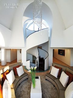
Once again, the design world lost a giant.  International interior designer Andrée Putman was laid to rest last week.  She was known for her advant garde furnishings (at the time) and dramatic minimalist interiors.  Andrée described her work as, "the perfect balance between discipline and revolt."  She required order in an environment; objects, space, color, light, and the people that occupy it should be the main attraction.


Morgans Hotel

Probably best known for her work at The Morgans Hotel, she practically invented the boutique hotel concept.  Andrée has designed skyscrapers ~ one in Hong Kong is called The Putnam, stores for the fashionable, and the homes of the wealthy world wide.  Often times, her small object designs, of which there are many, where inspired by the interiors she created.  Her elegantly tailored personal style often mimicked her interiors.  A signature of Andrée's was the black and white checkerboard pattern. 


Andrée was a champion of the high/low, modern/antique mix.  She believed good design should be accessible.  Andrée never formally studied design, but her interiors were critically acclaimed.  Another example of "good taste cannot be taught."
Intuition and unfortunate circumstances forced her to reinvent herself when she was 53.  Her firm Eclat was born and she set out to bring attention to designers of the 1930's, whose work was woefully under appreciated.  Modernist furniture designers and architects like Eileen GrayGaudí, and Jean-Michel Frank.  


via Design and More

as above


Remember the Concorde?  Andrée put her stamp all over it.  It's a shame it has been taken out of the fleet before I got my chance to experience it.  It must have been a wild ride.

The Concorde

While Andrée's daughter, Olivia, will continue to oversee The Putman Studio, as she has been doing for years now, I am sure Andrée will be watching from above.


Au Revoir  Madame Putman.


The Old Ball and Chain


Cuff Home


I loved this light the minute I saw it!  It's a beautiful sculptural statement lighting the way.
 These pieces marry form and function while making a casual, clever statement, no?


Wendy Schwartz Design

Part of the iconic UP series created by Gaetano Pesce in 1969, this chair shaped like a female figure attached to an ottoman representing a ball is exactly as it looks.  It speaks to the subjugation of women.  WOW, it's a seat and a grand statement.  It can be found at B & B Italia


Hable Construction has designed a Dynamite ball and chain fabric in linen and cotton.  It comes in several  color ways.


via Apartment Therapy


I don't know about the subjugation of woman ~ but Dr. L has been holding me back for years.  I'm a bird, I gotta fly...


Trendspotting ~Dip Dyed


Call me crazy, but I love a funky trend.  I may be getting too old for some, but there is always a way to incorporate a trend in some fashion without going overboard.  This dip dyed look seems to be peaking in popularity.  You know what happens when a trend peaks don't you?


David Collins successfully incorporated the dip dye look into the curtains below.  They really become a focal point because your eye is drawn to them and moves up the panels.  You take note of the ceiling.  Which is, in fact, notable.  If the drapes were all one color, you would not have been drawn to them and the ceiling the same way.


The Connaught, London

The subtle shading is easy to live with, and I like that you don't have to exactly commit to one color.  You get shadings or the gradation from dark to light or vice versa within one or more color families. This look is also called ombre, which literally means shading or shadow in French.  "In fashion" extends to the home as well.  There is always a cross over effect.  Often times, one will influence the other as I talk about frequently.


tumblr


This does the exact opposite of the curtains above.  Both work beautifully!

via Cococozy


via Girly Modern


woven ombre fabric by Melissa Kirkpatrick

Color Reform Rug via ABC Carpet


via Pinreach

Hepworth + Howard

via Hoard of Trends


via The Berry


Soft and subtle, or bright and bold ~ wearer, beware!  I think this is a trend that more successfully translates to the bed and not the head, but that's just me.  Although, if I was 20 ~ it's awfully cute.


The saturated to soft colors can feel like a modern approach to the look of the tie dyed 60's.  Everything that goes around comes around (but differently, I always say)


This pixelated, ombre colored rug would look fantastic in a multitude of spaces with it's sophisticated grid pattern and color palette.

Kelly Wearstler for The Rug Co.


via The Trendhunter


I'll adopt the look when someone guarantees me I'd look like Kate Beckinsale.  Her dip dyed hair is subtle and beautiful, nice for a slightly older woman.  Key word being~slightly.


The Trends driving 2013 ~ part 2


Domus Nova via desire to Inspire

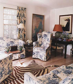
Chintz is back; softer and mixed with a more modern sensibility.  It's not your grandmother's glazed, shiny cotton chintz of old.  The colors are being reworked and updated on many archival prints.


Manuel Canovas


Digital printing is the wave of the future.  My girl Mary was a real innovator and many are hot on her heels.


These juxtaposed photo realist prints transfer easily off the runway and into the home, and vice versa.  Jakob Schlaepfer is doing innovative things with textiles.  I mentioned Charlotte Moss is working on a digitally printed fabric line based, I believe, on English garden design.  She spoke of it at a seminar recently.  I love them already!


There are always those that push the boundaries.  Wow, it is like I'm in the Rockies about to go over a cliff. I think I'd like my sofa a little less precarious, a little more zen.

Gaetano Pesce

The look of lace takes a hard line approach.  It's tough and tender, masculine and feminine.  Old school meets new school as we see the look applied in innovative ways.


Richard Schultz


Matthew Patrick Smyth


The bright and the beautiful; color will be saturated and bold.  While gray and pastels still have their place, optimism makes an appearance in the form of primary colors


M. Design Interiors


via The Decorologist


Thomas Britt


There's a lot to look forward to.  I have a feeling 2013 is gonna be a good year ~ but I don't want to rush anything.