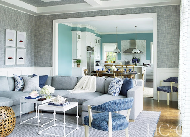
A client goes into a big box store .... ba da da... I think almost every designer has faced this situation at one time or another. Said client fills their home with furniture from one or two stores, in this case Restoration Hardware and Pottery Barn. They were having a party and wanted the place furnished. Then they wondered why their home didn't feel homey?
Box stores have their place, they really do, but you need that next layer. You need a professional, someone with an eye to create a curated consistency of color, texture and balance that a novice lacks, but that is necessary to bring a place to life, that expresses a family's personality and makes a house a home.
The owners of this Hamptons home learned first hand that walking into RH did not help them achieve what they ultimately hoped their home would look like. Luckily, they knew they needed more help and called in designer Gregory Shano.
It was Shano's job to take the white box filled with Restoration Hardware furniture, with some Pottery Barn thrown into the mix, to new heights with wallpaper, color, and additional pieces that work in harmony with what the homeowners had already bought. He was directed to warm up the place and give it character. The first thing he said he did was add grasscloth to the walls to warm the space up and make it feel a little more intimate.
That next level of warmth is extremely important, otherwise your home, well, just looks like a sales floor vignette,
There is a formality to the house that Shano wanted to respect, but still walk the fine line of also making it feel refined yet casual. That takes a deft hand, and I think Gregory hit the nail on the head.
Ahhh, I could be happy here.
photos via Tria Glovan


No comments:
Post a Comment
If you like what you read here at Carrie's Design Musings, consider leaving a comment wouldn't you? XO