I am a little behind the eight ball with this post ~ but better late than never! The DIFFA event held last month is consistently one of my favorite events ushering in the very full Spring season of festivities. Dining by Design was bigger and better than ever this year due to the fact it was taken out of Pier 94 where it had previously been held, and into its new home next door at Pier 92. This freed up more space for the event as well as exhibitors participating in the Architectural Digest Show, which runs concurrently. Every year I am amazed at the level of creativity, beauty, and inspiration I take away from walking thru this stunning, over the top tabletop fundraiser.
Above, Stacey Garcia's multi layered, three dimensional flowers from her Paper Muse collection of wallpaper for York WallCoverings was her starting point. The oversized, textural, patterned paper with a touch of metallic with an abundance of real white anemones is a celebration of Spring as well.
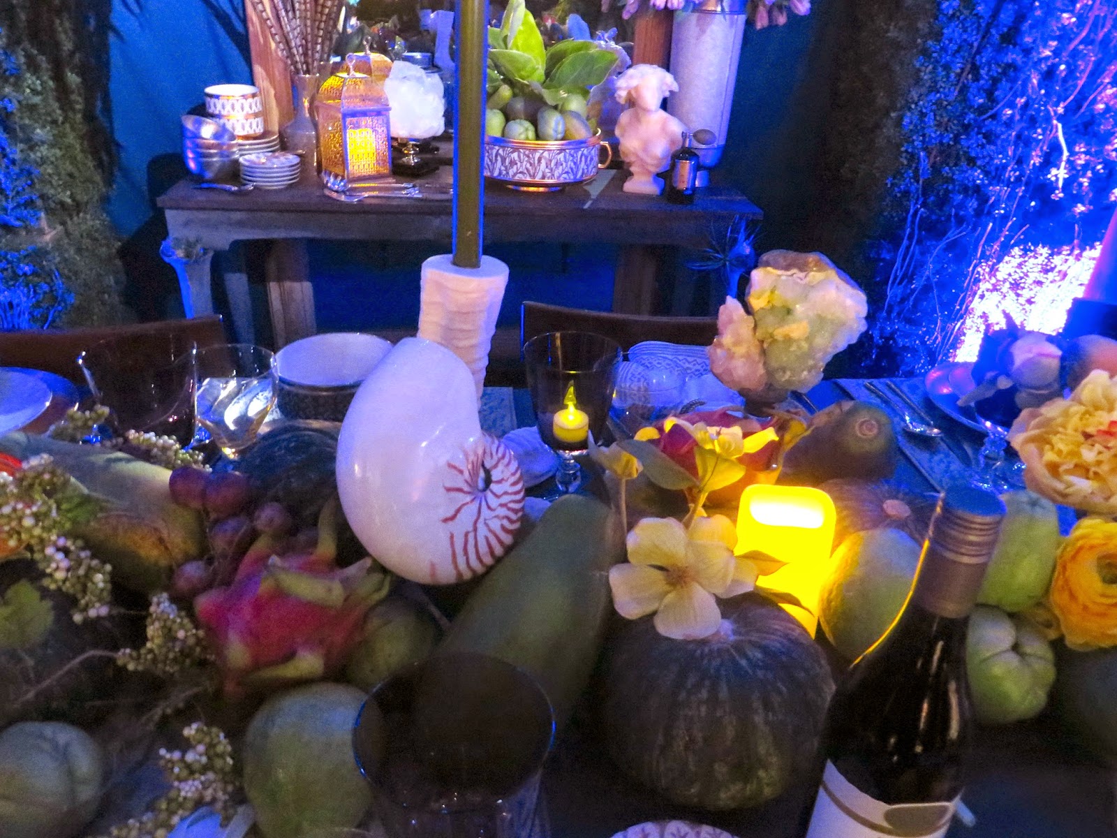
Robert Passel's vignette was a feast for the eyes and more like a woodland garden environment than a tabletop display. An abundance of everything! I spy Areté Collection, L'Objet Fortuny, Opiary, and more!
Ralph Lauren's understated, "under constuction" vignette not so subtlety reminds us of his extensive paint line.
Kitty Hawks and Spin Ceramics created a serene Japanese tearoom setting. I fell in love with, and wrote about Spin ceramics in my AD roundup here
 |
| * |
Tyler Wisler's interactive French bistro came to life as burlesque dancers entertained atop the small podium set up during the gala. The Zia Priven lighting was my focal point and it certainly complimented the Constentino floor tile.
 |
| * |
Hermes was one of my favorite spaces. I loved the new Voyage en Ikat porcelain place settings that spoke of far off places.
Marks and Franz, the design duo behind such fabulous spaces as Carrie's apartment in "Sex In The City" and the film "The Devil Wears Prada" really knows how to make a statement! They used the old Metropolitan Opera House as a backdrop for their "curtain call." The Celerie Kemble delicate metal framed chairs called me from across the room, and I love how they incorporated the gold wire into the floral display dramatically running the length of the table.
"I am ready for my close up"
Corey Damen Jenkins, who has a smile that lights up a room, turned the space upside down. The flowers were on the DeGournay wallpaper panels and he used oversized lamps from Global Views to grace the center of the table. I love that! Robert Allen provided the fabric for the tablecloth and a single succulent grounded the Arte Italica place settings.
 |
| * |
Dransfield and Ross along with Sunbrella created a riot of color that was surely the brightest space of the day; a cornucopia of color and texture. The assorted colored glasses formed a sort of sculpture that seemed perfectly at home.
Hunt Slonem, who I wrote about recently here, gave us 2 renditions on a theme all his own; one with bunnies and one with birds. This is his moment in collaboration with Kravet/Lee Jofa.
Bronson Van Wyck and Architectural Digest designed a folly, inspired by The Tartar Tent at Chateau de Groussay in France as a place for dreaming and dining, a respite from the cold. The original is covered in delft tiles, while these are fabricated on cloth with a chandelier from Curry and Co. and place settings by Bunny Williams for Ballard: magnifique!
Stephen Burks showcased Roche Bobois' The Traveler chair from their 40th anniversary collection helping create a cozy campfire setting. I fell into those comfy chairs and dreamed of warmer days.
Calvin Klein shows us time and again that there is always beauty in simplicity.
* photos:Architectural Digest and CLI


.jpg)


No comments:
Post a Comment
If you like what you read here at Carrie's Design Musings, consider leaving a comment wouldn't you? XO