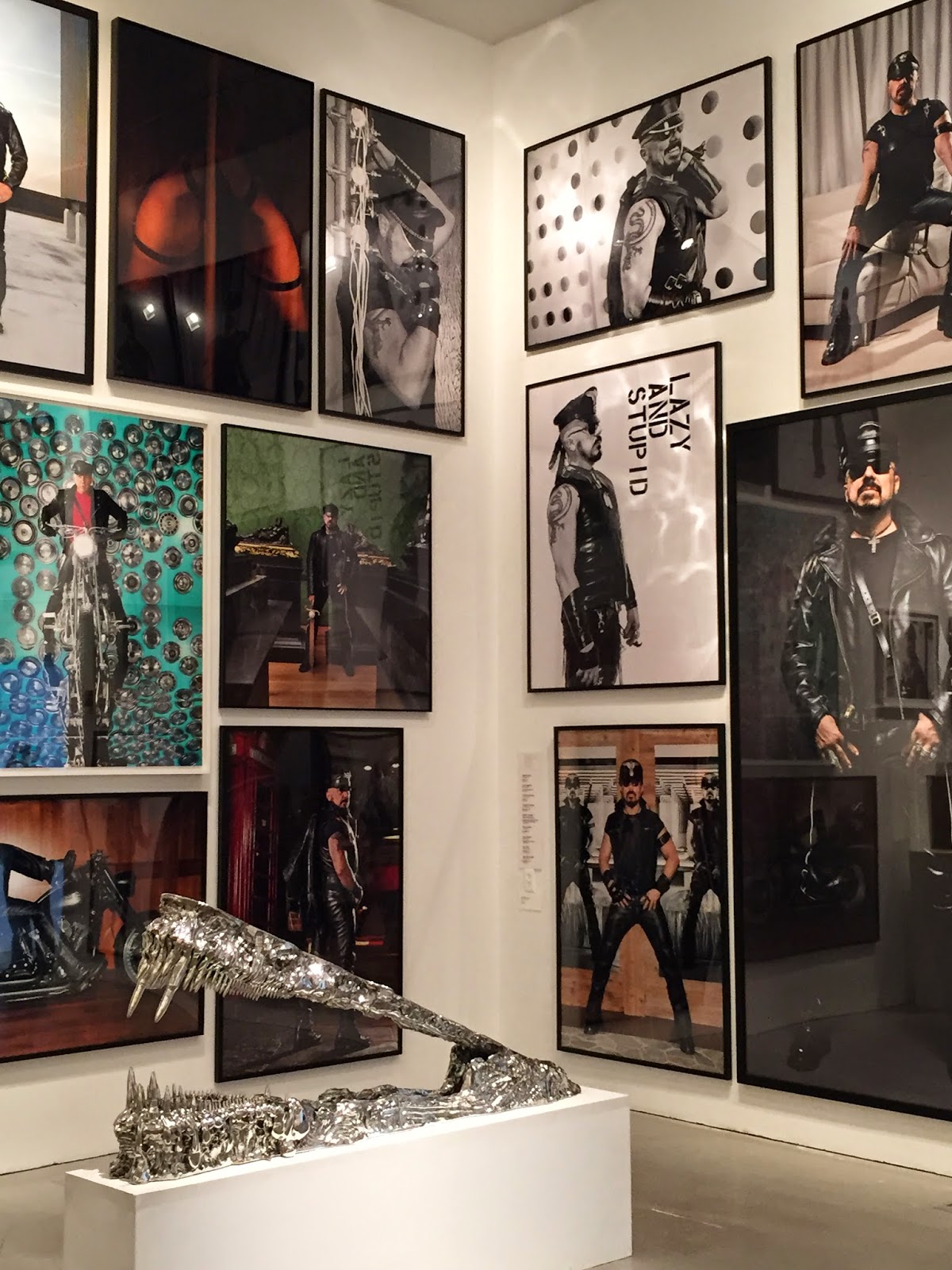
"Looks are deceiving" is an understatement when discussing Peter Marino! The man looks more like a member of Sons of Anarchy than a world renowned architect and designer for some of the worlds most luxurious brands. While in Florida, I wanted to see the exhibit devoted to this extraordinary man at The Bass Art Museum.
This quick video gives you a peek into Peter's world. Once you get past the leather (all of which he designs himself), the clicking of his many skull rings, and razor blades hanging from his neck, you find a forward thinking, creative genius with laser focus. Hence, the name of the show ~ One Way. I'm gathering it's his way or the highway. The way Peter views the world.
I would describe the exhibit as a deeply layered and nuanced peek into his life as viewed thru art and the progression of the galleries. (I hear you saying, "Huh?") Trust me, if a docent hadn't explained what we were looking at, you would never have realized the significance of much of what you were viewing. It's a shame because it's fascinating; steeped in symbolism and significance!
"Curated by internationally renowned cultural agitator and curator Jérôme Sans, the exhibition explores the interplay between Marino’s iconic architectural designs, his personal collection of contemporary art and his series of cast-bronze boxes. True to the architect’s practice of creating bespoke environments at the intersection of art, design and fashion, One Way: Peter Marino will feature commissioned new work by artists Gregor Hildebrandt, Guy Limone, Farhad Moshiri, Jean-Michel Othoniel and Erwin Wurm."
The Miami show mainly shows his pop art for a young, fun audience. His renaissance art and bronze boxes,which there is much of, was not the focus, although some boxes were incorporated along side the colorful art to emphasize his duel aesthetic.
Peter's fascination with art began when Andy Warhol came calling. Andy wanted to barter with Peter to have some work done. The human heart was Peter's first piece and it began a lifelong love of collecting. He got really serious about collecting in the late 80's when business began booming and 17 Barney's stores were commissioned.
 |
| Guy Limone, Red, Black And Grey-White Tapestry, 2014. Andy Warhol, Human Heart, Circa 1979. Rendering Courtesy of Peter Marino Architect, PLLC |
With the heart behind you, you rise into this 2 story gallery or an art installation in black and white.
The film strips are from the 1950 Jean Cocteau movie Orphée. They create movement and therefore an eerie "underworld" effect. The exhibition is rich with symbolism, much taken from the classic story of Orpheus . In Greek mythology, Orpheus was caught between the worlds of life and death. It represents moving away from the underworld, into the living world. The film and ramp lead you to the next gallery which has a distinctly different focus.
A commissioned glass rosary is a focal point, done by Parisian artist Jean-Michael Othoniel
Works by Damien Hirst, Richard Serra, Keith Haring, Richard Price and others help tell the story. Some commissioned, some part of Peter's private collection.
At the top of the ramp you see the intersection of Peter's love for art, fashion, and architecture come together in video clips of a Chanel jacket that inspired a store, that inspired a building. On that landing you are leaving a dark period and come into a brighter one ~
The underworld gives way to paradise. Bronze boxes by Peter are accentuated by the knife installation by Farhad Moshiri, an Iranian artist living in Paris. Placed between them is a print by Andreas Gursky creating a powerful assemblage.
Art about Art is all about the colorful pop artistry of artists that inspire Peter today. Their work is "borrowed" from the past. Vik Muniz "borrowed" Monet's waterlillies, collaged photographs of nudes by Richard Price echo the work of Picasso. These images demonstrate how Peter is influenced by these contemporary artists. He "borrowed" the form of Richard Deacon's sculpture Upper Strut when designing a Louis Vuitton store.
There was a gallery sheathed in black leather, Mr. Marino's material of choice, that is devoted to 48 Robert Mapplethorpe photographs.
Skulls are an important and reoccurring symbol in Peter's world, so images and sculptures were represented as part of the totality of Marino's artistic expression.
Of course his body of work is a show in itself. His prolific portfolio is alphabetized by store and state or country in light boxes that I could have stared at for hours!
If you had a spare 1 1/2 hours, you were welcome to perch yourself on a Claude Lalanne ginkgo bench, with a Francesco Clemente silkscreen on the back wall and watch a production of Gluck's opera "Orfeo ed Euridice" (the story of Orpheus) playing on four screens that he and his wife produced in their NY apartment for 120 of their close friends.
Linking the past to the present, the historical to the contemporary, emphasizing materials, texture, scale and light, always looking forward, and making art an integral part of every job as the dialogue between interior and exterior exists in Peter Marino's singular vision is what has shaped him into one of the most iconic architect's working today.
video by Creative Class


No comments:
Post a Comment
If you like what you read here at Carrie's Design Musings, consider leaving a comment wouldn't you? XO