
 |
| * |
Sorry for the radio silence. I'll talk about the whats and the whys in a future blog post, but for now ~ on with the show. It's spring, and that means the always fabulous, aways exciting Kips Bay Showhouse. There is a reason why this is the "grand dame" of showhouses. This year was bigger and better than ever! Six floors of eclectic, luxurious, creative design!
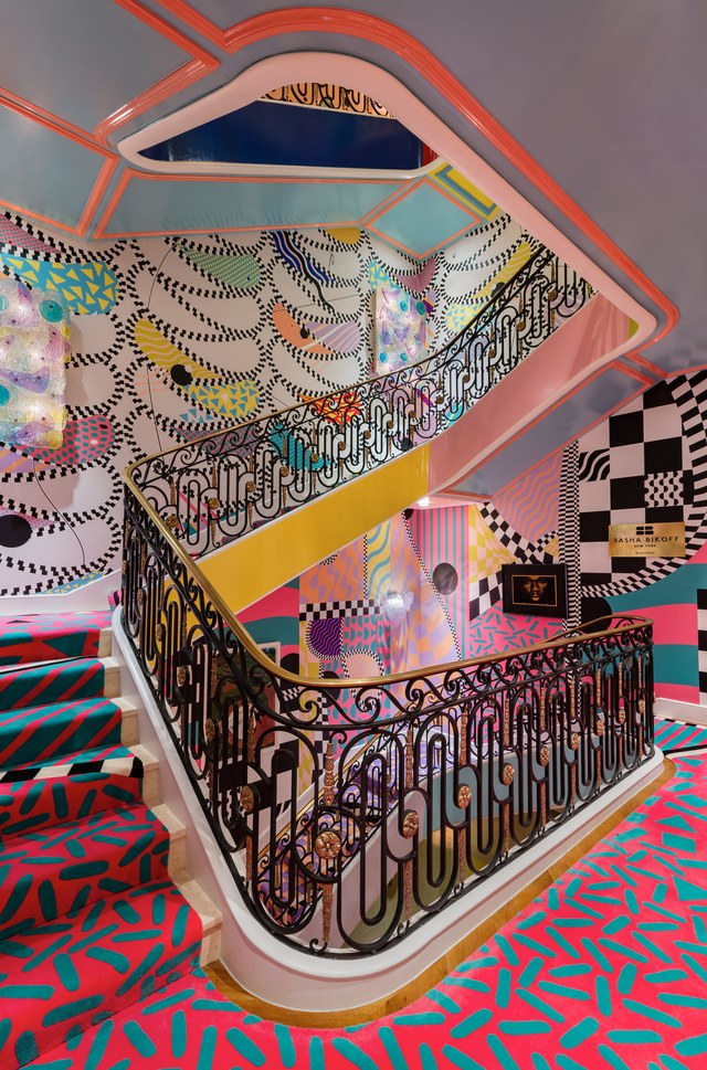
Sasha Bikoff's crazy kaleidoscope of a grand staircase is all over social media. Her inspiration was wild, wacky 1980's look of Memphis Milano style, mixing patterns and colors that have a fun, playful look that the kids of Kips Bay could relate to. She even incorporated some of the kids club artwork. I've never been to Memphis, but note to self... I must check it out. The Rug Company customized the rug (obviously) using several different patterns and colorways. The wallpaper is by Voutsa. Pee Wee Herman like accessories looked right at home. It is definitely a talking point.


Everything Juan Montoya does is exquisite. He was charged with an awkward stairwell and great room in the (dare I say) basement, but oh what he did with it! The Moonlight Room as Juan refers to it because it came to him in a vision, it is all about cosmic forces. The ever changing celestial orbit pulls you through this space. The carefully curated classic details, geometry, soft circle and layers create a scared retreat, but that paneling is EVERYTHING!


Back on the 1st floor Dan Fink made the most out of the main hallway creating a quiet glamour that very much exemplifies the home's history. Taking cues from the classic stair rail, Dan layered Gracie Studio shimmering wallpaper with a mix of old and new furnishings to accentuate the strength and romance of a bygone era.


The Baccarat fixtures, a somewhat unusual look for this iconic company had me at hello. A perfect choice for the bespoke Clive Christian kitchen with its Metro Deco cabinetry in walnut, marquetry wood veneer inlays and leather backed open cabinets. The company teamed up with Dacor for a fully integrated system of appliances with advanced technology.


The kitchen on one side opened to a David Netto "red room." The color holds significance in design and color psychology because it is after all, part of the kitchen. The juxtaposition of chunky, modernist furniture is all about looking forward, and dreaming ~ hence the books as a metaphor.
 |

so much more design goodness to cover ~ part 2 next time
* photo Nickols Sargent
No comments:
Post a Comment
If you like what you read here at Carrie's Design Musings, consider leaving a comment wouldn't you? XO