Dorm Room Decorating

via Pottery Barn

It’s that time of year again when High School graduates are leaving home and heading off to college.  What will it be like?  Will I make new friends?  Will my classes be hard?  And most importantly, what is my roommate like and how will we decorate the dorm?

So many good ideas abound, there’s no reason why “the dreaded dorm room” can’t be warm, colorful, and reflect the personalities of its occupants.  Don’t let the small quarters cramp your design style.  Here are some tips and tricks to take your dorm room from bland to beautiful.  First, consult with your roommate on a color or theme that you both can live with.  Then, think outside the small white box!


Think multi-functional.  Each piece should have a dual purpose.  A futon, small poufs or stacking tables can do double duty, and valuable floor space is not wasted.  Think vertically and look skyward.  Use the walls to organize and personalize.  Decorative shelving and boxes keep clutter at bay.  An added bonus ~ it creates another layer of interest.  


Elevating beds or building a loft allows you to use the premium space underneath for storage, and is a no brainer.  Designate areas for eating, sleeping, and studying.  Layering fabrics and carpets creates a sense of coziness, while no sew curtains inject a major design wow, second only to the bedding.   


Self adhesive hooks are ideal for hanging art, decorative mirrors, or framed photos.  Temporary decals jazz up any cement wall and allow you to personalize your dorm.  You can then conveniently reuse them in your next space.  Also, have you seen what you can do with Duck Tape these days?


Often, the lighting in a dorm is dismal and not conducive to living and studying adequately.   This I have never understood.  Think layers of light.  A desk lamp is always a must, but also consider a lamp clipped to the headboard or a floor lamp nearby for reading.  You also need to think about your task lighting for doing the necessary chores that go along with daily living; eating, applying make up, entertaining, etc.


Like anything else, you can choose to go minimalistic or crazy.  It’s up to you (and your roommate).  Max's dorm room was so memorable The New York Times did a piece on it.


If you're feeling really ambitious, there so many DIY tutorials on how to make headboards or create the dorm room of your dreams, whatever that may entail.


Thinking outside the little cement box and creating a room that expresses and comforts you, promotes well being, functions efficiently, is conducive to studying and sleeping, (because isn’t that why you’re really there?) is a task worth 
tackling.


Plus, these small space tips will help you then transition to your first apartment.  

For more great ideas, visit my Pinterest board.


Hampton Showhouse ~ 2013


I feel I am woefully behind posting on all the activities happening this summer.  It has been a whirlwind!

I can't forget the Hamptons' Show House.  I plan my summer weekend around the ability to see this always inspiring house.  It has received much coverage, so I will show you what I fell in love with ~ I felt a bit of déjà vu, as if I was walking into the same space as last year, but the 2013 house has bigger, with better proportions (or so I was told).
Again, while all the rooms are gorgeous and notable, I am mentioning but a few.

What is the first thing my little eye spied?  Fabulous lighting.  The sunlight danced off the bits of mirror of this dramatic Corbett light fixture, and drew me in like a moth to a flame.


And I kept going, following the glimmer and glow toward the Scalamandre dancing zebras, always a designer favorite, thru the butler's pantry.  The grill work on the cabinet doors reinforced the jewelry for the home theme I was seeing.


I didn't have time to catch my breath before being swept up in Sherrill Canet's ethnic inspired living space.  Using colorful Suzani print fabric, restful neutrals, and dramatic punches, she always entertains the eye.  I do love a take away; these assorted mirrors make a dramatic display that anyone can create in their own home.  It's easy, can be done inexpensively, and the mirrors can mix or match


I loved the laser wood cut outs covering a few of the windows.  I am going to have to borrow that idea.


AND more great lighting, as the hammered brass and crystal pendent was a perfect counterpart to the treasures residing in the room from Carlos de La Puente.


Celerie Kimble's huge bedroom filled with her eponymous collections; everything from her wallpaper to furniture, all gorgeous, curated with an exacting eye.  It is elegant yet comfortable with a bit of whimsy, a Celerie signature.


There was a lot of "jewelry" in the room:  gold, bone, sparkle = LOVE


Thru the open fireplace to the space beyond sat probably my favorite room in the house by Bradley Stephens.  I cannot resist animal print, fur, Lindsey Adelman lighting, and an eye for upscale detail!


Vintage Vuitton suitcases are tucked discreetly under the daybed.  The combination of rough and luxe resonates!


You always know when you walk into a Barbra Ostrom designed room.  It's going to be over the top with a wonderful mixture of texture and lots of layering.  Again with the fur, the faux bois (wallpaper) and painted floral ceiling, it is beachy.  But, it's anything but predictable.


Jewelry for the home was a theme I saw in many of the rooms, and each time caught my attention.  From the beautiful drawer pulls by Finesse on the bath cabinetry


to the hardware in the kitchen by Bakes and Co. ~ each beautifies and enhances:  Design details that matter!  Notice too, the doors coordinate from one side of the room to the other but do not match.


Art always takes center stage in a show house.  An eclectic collection of  pieces, married with an assortment of Hermes scarves, either  framed or used as pillows within Lynn Scalo's bedroom spoke of a love for fun and adventure.


I just loved the muted colors, the linen sofa you felt like you could fall into, the unexpected choice to do the stripe wallpaper on the  pitched ceiling for added dramatic effect, and the "barely there" sculpture that gave the room dimentionality, by Baltimore Design Group.


The dramatic 2 story living room of Brian Del Toro with it's faux bois wallpaper (again) and very sophisticated red,white, and blue color scheme married an array of antiques, mid century, and contemporary furnishings with aplomb.  Brian was inspired by a recent trip to China and a costume he saw at the Opera while there.  It drew me in, but also framed the backyard which drew me out.  Not an easy task!


 The out door space was as equally serene as it was and hip.  There were a lot of nice "moments" and spaces for out door entertaining.


Ahhh, I could be happy here.  Have I said that before?

The Hampton Designer Showhouse is only open for another 10 days, so if you get a chance, it is something to see!


Talk to the Hand

@ !st Dibs

I have long been swooning over the iconic Pedro Friedeberg hand chair.  It is equal amounts edgy, cool, and functional.  Surprisingly, it is comfortable too.


Kelly Behun


Whenever you see "the hand," whether it be in a room full of traditional furniture, antique filled interiors, or in the home of a modernist, it screams hip.

You must take a look at Pedro's website, just to see his many quips.  An Italian humorist by way of Mexico; this man must be a panic!


Jorge Elias


Kelly Wearstler's Office


Sig Bergamin


Jonathan Adler

"I have invented several styles of architecture, as well as one new religion and two salads.  I am particularly fond of social problems and cloud formations. My work is profoundly profound."

"I admire everything that is useless, frivolous, and whimsical.  I hate functionalism, post modernism, and almost everything else.  I do not agree with the dictum that houses are supposed to be ‘machines to live in’.  For me, the house and its objects is supposed to be some crazy place that make you laugh." ~ Pedro


Emily Henderson


Jamie Drake via Todd Merril


Michael Herold

Turns a serious room on its ear


Gwynn Griffith

In this bathroom it's kinda crazy, sexy, cool ~ maybe that's just Lenny Kravitz (did you know he's a musician and a designer?)


Lenny Kravitz

There are plenty of imitators out there.  While there is nothing wrong with that, if you are interested in an original, look for long slender, detailed fingers, a signature, and a 5 figure price tag


Hmmm, let me ponder that.


Comerford Collection


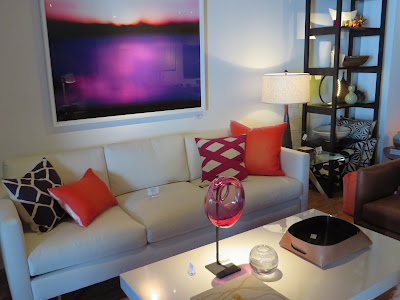
It's always a great surprise when I go into a store and I love everything in it.  I was thrilled to have discovered Comerford Collection a couple of years ago when I was shopping in the Hamptons.


The furniture is seeped in moderism; I'm calling it approachable modernism.  There's a twist. Traditionalists who appreciate refined, elegant, clean lines can feel comfortable with Comerford's well curated environment and the perfect selection of accessories to match.  Much of the furiture is custom made.


Lighting and art work are a big part of why the store's vignettes are so visually enticing.  Amagansett local Andy Stenerson's glass creations look right at home.


I love these leaning shelves, sold as a set, and perfect for that bare wall.  Form and function live here beautifully.  Textiles also play a central role in the look and feel of the store.


Karen Comerford, who began her career illustrating cards for Hallmark, describes her design style as a lover of edited refined spaces, but with idiosyncratic elements.  So of course, it's no coincidence that also happens to describe her store.


                                   Comerford Collection
                                     2442 Main St.
                                   Bridgehampton, NY