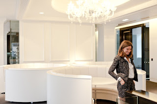
Chic just happens in New York when my all time favorite on line shopping mecca, Net-a-Porter ( I am a worshipper after all) as well as The Outnet and Mr. Porter opened an office in the city this past July. Keeping its identity intact on the other side of the pond was a priority for the design team at Studio Fibre . The London office, with its Parisian apartment inspiration, was so mesmerizing when that was unveiled there was no question that the overall design convey continuity and be thought of as a "working wonderland."
Natalie Massenet has a lot to smile about with the growth of the companies she founded at 73 % this year and that's in the US alone. Net-a-Porter is described as having a masculine presence with a feminine finesse. I like the sound of that.
LONDON ~
The question was how to take an airplane hanger like space and humanize it. The cavernous space was designed to be a hybrid between business, a photography studio, retail and event space. That's a place I'd want to spend my day! Its mix of hi/low materials, matte/hi gloss finishes, Murano chandeliers and industrial lighting create a picture perfect backdrop for a fashionable design driven business.
Now I know where all my money is going! If you haven't visited Net- a- porter , The Outnet or Mr. Porter I encourage you to do so but caveat emptor; I cannot be responsible for the possible addiction.
Ph: NY via Hypebeast, London via Dezeen by Pantling Studios


No comments:
Post a Comment
If you like what you read here at Carrie's Design Musings, consider leaving a comment wouldn't you? XO