 |
| Nievera Williams |
At the risk of sounding like a cliche ~better late than never applies here. Between Spring Market, Blogfest, my day with Traditional Home (more about that soon), and writing for Philly.com, this blogger has been busy! But a highlight is always Kips Bay. There is no better show house. Between the talented designers and the upper east side address, there was enough eye candy to fill a... brownstone.
 |
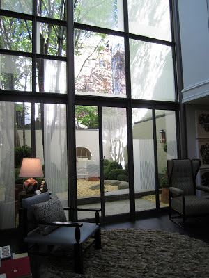
I loved that it appeared to be a new crop of savvy designers joining in the fun this year. James Huniford had a swanky double height living room that was a textural and visual triumph.
Andrew Suvalsky worked his magic in the entrance sitting room and powder room. Jewel colors, color blocking and A LOT of lacquer = LOVE
You can see yourself in every surface ~ that's what I call a lot of face time.
Kristen McGinnis got the lacquer memo. The dining room was a showstopper in her hands with its high shine, art, and metallic touches.
The console belongs to a client. It looks as if the center of it is exploding and the fabulous neon and branch chandelier was designed by her friend, LA artist Elliot Hundley. The dining room overlooks the den. I could be happy here!
Garcia Maldanado had another layer-filled room of lusciousness. From the leather walls and the custom settee to the smoked mirror backed shelves ~ this room was sexy!
I loved the landing that Judy King designed. It was a great moment with its malachite, amethyst, and zebra: the perfect cocktail.
Barbara Ostrum's room held all my favorite materials: fur, crystals, gold. She was inspired by a curly lamb stool (off to the left) that stopped me in my tracks at The Architectural Digest Show.
Jack Levy designed what looked like an undersea wonderland at first glance. The fish wallpaper by Cole and Son, Fornasetti II Acquario, was surprisingly stunning and all the elements played perfectly off that.
Eve Robinson's modern aesthetic is always infused with "a dash of drama." I feel the need to lacquer something immediately!
Kathryn Ireland did an Anglo Indian inspired bedroom which was a departure from the rest of the house, but no less beautiful. She filled the room with fabrics from her new Scalamandre collection. Birds by Hunt Slonem.
West Chin, who I was thrilled to meet, thrilled me with his architecturally interesting koi pond in the sky.
Let's continue to talk about Wes Chin next time. I have a few thoughts ...


No comments:
Post a Comment
If you like what you read here at Carrie's Design Musings, consider leaving a comment wouldn't you? XO